
Guide Dogs XD and Migration Project
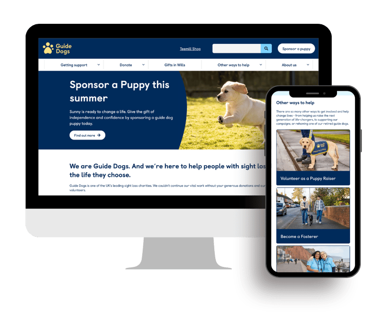
Guide Dogs embarked on a large-scale digital transformation to modernise its website, improve user experiences, and migrate thousands of pages to a new Contentstack CMS. Working collaboratively with internal stakeholders and Inviqa (Havas CX), I helped redesign key user journeys, improve conversion-focused experiences, and contribute to a streamlined content ecosystem that better served users while simplifying long-term content management.
Role
Platforms
Contentstack, Figma, Jira, Miro, Google Analytics, Screaming frog.
Project duration
UX Designer, Content Designers and CMS Specialist
9 months
Project Overview
The existing website had evolved over many years, resulting in:
inconsistent user journeys
duplicated content
overly complex navigation
lengthy product journeys
difficult content governance
an ageing CMS
At the same time, the organisation needed to migrate thousands of pages while ensuring minimal disruption to users.
The Challenge
Reduce content complexity
Improve Homepage experience
Conversion focused journey
Simplify content management
Large scale website migration
Improve Sponsor a Puppy journey
Objectives
To summarise, here are the things I gained experience on as part of this project
UX Design
Wireframing,
Information Architecture,
User Journey Mapping,
Stakeholder Workshops
Content Audits
Design Reviews
Accessibility Reviews
Cross-functional Collaboration
CMS Migration Planning
QA Support and UAT
My Role
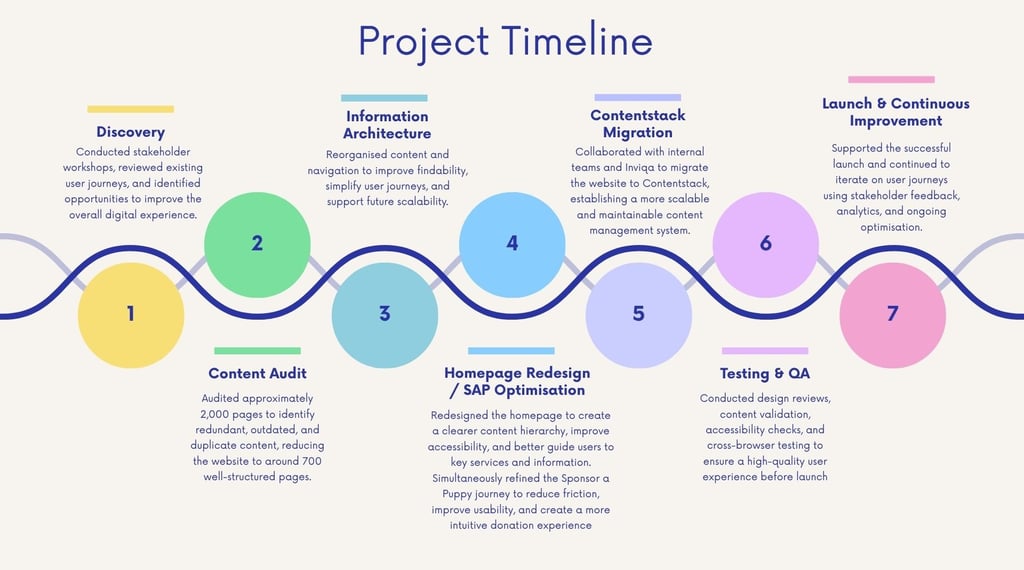
Visual project timeline
Design Improvements
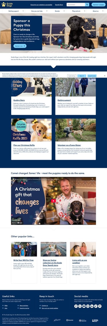
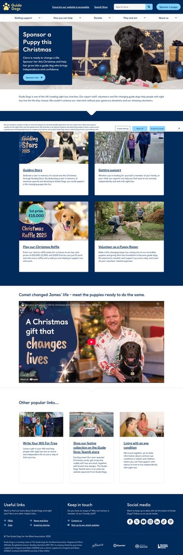
Working collaboratively with internal stakeholders, content designers, developers and Inviqa (Havas CX), I helped to shape the redesign of the homepage experience by:
Improving the information architecture and content hierarchy.
Reviewing user journeys to surface the most relevant services earlier.
Collaborating on the redesign of the hero section to include stronger messaging and more engaging visual storytelling.
Introducing a more modular homepage structure that allowed greater flexibility for future content.
Supporting accessibility improvements throughout the page.
Working closely with developers during implementation and quality assurance.
Homepage Redesign
The Challenge
The Objective
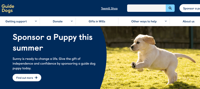
The previous homepage was heavily focused on a limited number of priority actions. While it supported key fundraising initiatives, it didn't fully represent the breadth of Guide Dogs' services or effectively support users with different goals.
The layout consisted of:
A large hero banner with limited supporting content.
Four fixed navigation cards directing users to Donations, Fundraising, Services and Campaigns.
A promotional video.
Three additional promotional cards for featured campaigns.
Although simple, the homepage offered limited flexibility, placed significant emphasis on fundraising, and required users to navigate away from the homepage to discover many of Guide Dogs' services and support offerings.
The redesign aimed to transform the homepage into a more engaging, informative and accessible entry point that better reflected the organisation's evolving mission.
The goal was to:
Improve the first impression through richer storytelling.
Showcase the full breadth of Guide Dogs' services.
Create clearer pathways for different user groups.
Increase content discoverability.
Build a homepage that could evolve with future campaigns.
Improve accessibility and mobile responsiveness.
Better balance organisational priorities between services, support, fundraising and volunteering.
Old Homepage
My Contribution
Improved Content Hierarchy
Content was reorganised into clearly defined sections that guide users naturally through the homepage.
The redesign balances organisational priorities while making it easier to discover:
Donations
Fundraising
Volunteering
Campaigns
Services
Information for people with sight loss
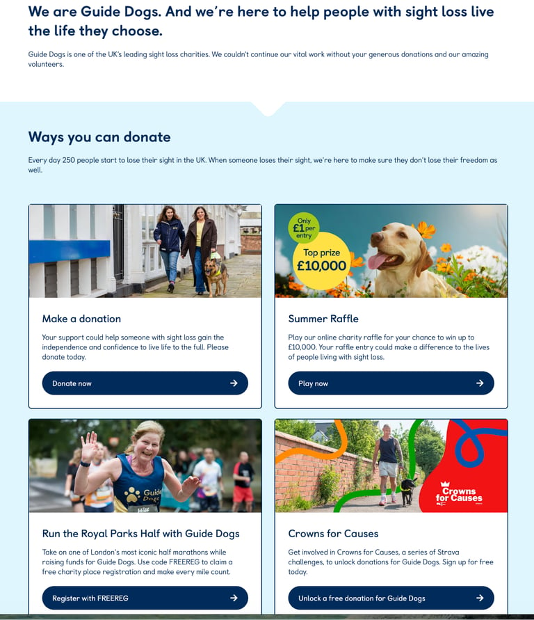
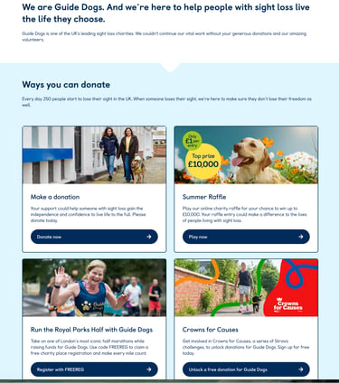
A More Engaging Hero
The homepage hero evolved from a traditional banner into a richer introduction featuring the distinctive curved blue design, stronger messaging and clearer calls to action.
Better User Pathways
The homepage now provides multiple entry points depending on user intent. Whether users want to:
donate
access support
volunteer
learn about Guide Dogs
sponsor a puppy
explore services
they can identify a relevant pathway much earlier in their journey.
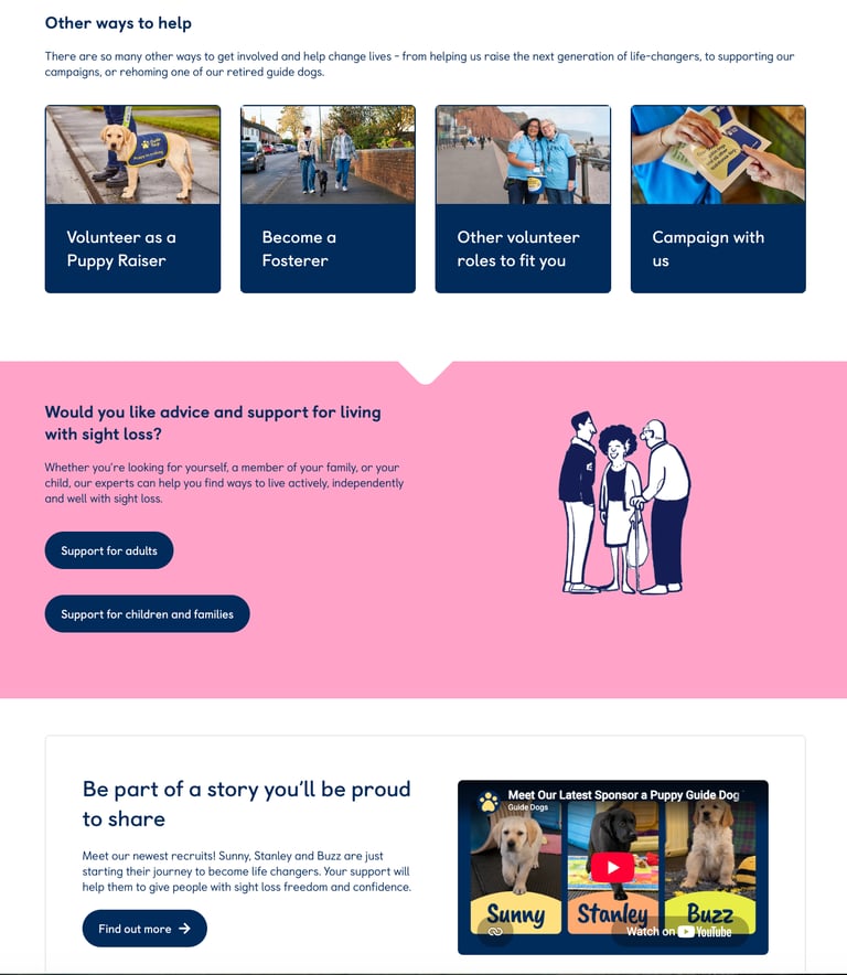
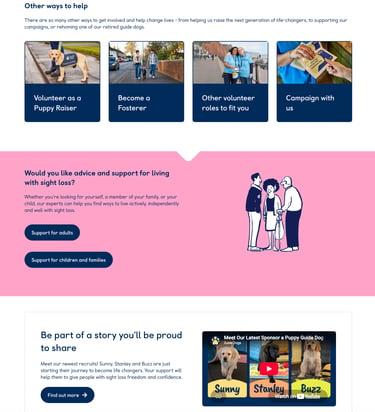
Richer Storytelling
Instead of directing users towards only a handful of key actions, the redesigned homepage introduces multiple opportunities to explore Guide Dogs' work through stories, featured campaigns, services and ways to get involved.
Increased Flexibility
The previous homepage relied on a relatively fixed layout.
The new modular structure enables content teams to highlight seasonal campaigns, promote new services and update priority messaging without requiring significant design changes.
Outcome
The redesigned homepage evolved from a campaign-focused landing page into a scalable digital gateway that better reflects Guide Dogs' mission and diverse range of services. By improving information architecture, visual hierarchy and content flexibility, the new experience helps users discover relevant information more easily while providing the organisation with a future-ready platform that can adapt to changing campaigns and priorities.
Explore the finished product
The Migration
Simplifying a Complex Content Ecosystem
2,000 pages audited
reduced to around 700 strategically structured pages
removed duplication
simplified navigation
improved findability
established reusable content models
improved governance
Project Outcomes
Successfully contributed to a nine-month website transformation.
Collaborated with internal teams and Inviqa (Havas CX) to redesign critical user journeys.
Reduced the website from approximately 2,000 pages to around 700 strategically organised pages, creating a clearer and more maintainable content ecosystem.
Improved Homepage navigation, visual hierarchy, and content discoverability.
Supported the migration to Contentstack, enabling a more scalable and flexible content management platform.
Helped establish a stronger foundation for future digital services through reusable content structures and cross-functional collaboration.
What I learnt
This project reinforced the importance of collaboration across design, development, content, and product teams. Beyond designing interfaces, I learned how large-scale digital transformation depends on balancing user needs with organisational goals, managing complexity, and making incremental improvements that collectively create a significantly better experience.
Contact
Let's chat about your next UX project.
colourmeinstyle20@gmail.com
© Pooja Parate 2026. All rights reserved.